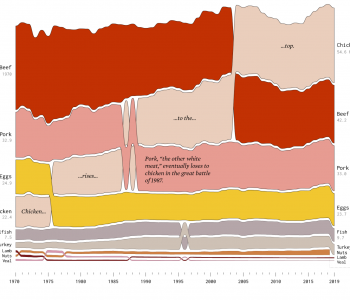
Data
Data
Misleading visualization: Facebook Covid-19 Symptom Map
This research by Carnegie Mellon University (disclosure: alma mater) via Facebook is a novel approach to virus tracking. They are putting up a quick quiz on FB around Covid-19 symptoms that have shown to be the strongest predictors and aggregating that data by geo. Time will tell if this is at all predictive of outbreaks but there’s a problem with the visualization presented which makes the map misleading.
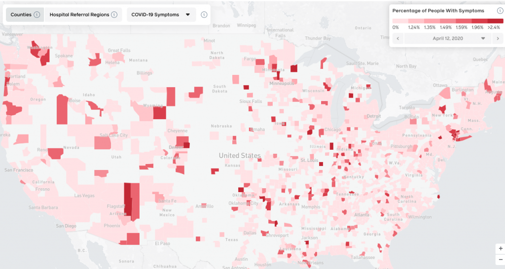
Notice the large white swaths on the map (broken down by county). Upon quick view, one views them as little to no infection rate. The mind naturally interprets the darker color as a higher infection rate and that, in fact, is what the key indicates. However, the lowest infection rate (0-1.23%) is a red-white mix that I’d guess is 80-90% white. Thus, the brain naturally interprets white as 0%. However, that’s not what white represents on the map. Rolling over one of those counties reveals that there is not enough data for a prediction. I’m glad the data scientists are insisting on statistical significance but using white breeds misinterpretation.
The counties with insignificant data should be grey or, even better, grey striped. This immediately signals to the brain that this is not on the same scale and inspires further investigation. In addition, the brain can then more easily filter those areas out when looking at the map. And presenting this on a map is important given how proximity matters but the current presentation is flawed.
In addition, presenting this at the county level is also misleading. There are counties like New York (aka Manhattan) which do not have enough real estate to appear even though its one of the most affected at this point. And, as any followers of presidential election maps will note, there are massive, lightly populated counties in the mid-west to mountain time zones that overly influence one’s interpretation of infection density. Look at Navajo county in Arizona for one example of that. Facebook has more fine grained geo data than that and the presentation should be based on a meter/mile radius weighted average that makes sense based on epidemiology. In addition, population density is not represented at all here.
In the end, this is a worthwhile pursuit but this presentation does more harm than good.
Bonus note: notice Facebook’s “data for good” naming; Covid-19 as a re-branding opportunity?