Skip to content
Assert Digital Ventures
  • About
  • Publications & Media
  • Newsletter
  • Blog

Why 3rd party research should not be a primary…

  • June 13, 2021June 13, 2021
  • by Andy

One mistake I find product managers often make is overuse or over weighting of third party research findings. While 3rd party research has its utility, it a) rarely asks the specific questions about what people need and b) looks backwards when you’re trying to find proxies for the future. Let’s look at an example.

https://flowingdata.com/2021/06/08/seeing-how-much-we-ate-over-the-years

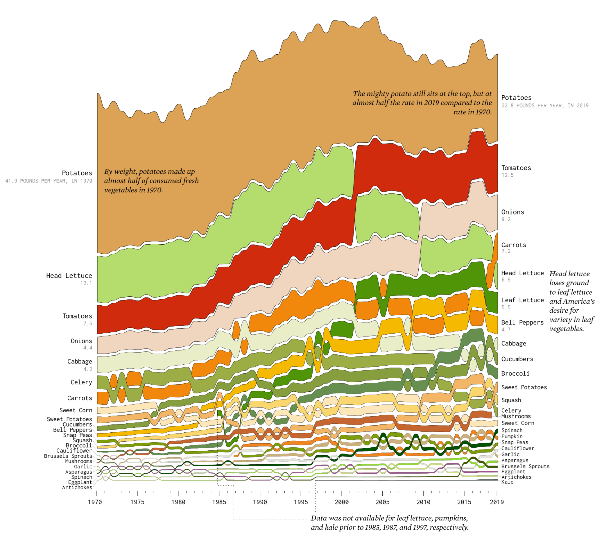
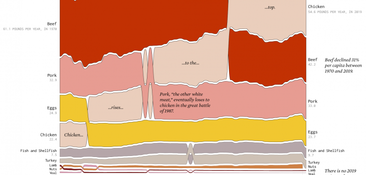
This recent infographic shows changes in food consumption behavior since 1970. There are several interesting insights including how chicken is now the most dominant protein (was beef) and leaf lettuce was non-existent as a concept in 1970. Diving deeper into the vegetable chart, one can see several other interesting changes. If you were a food products company (anywhere in the value chain) thinking about new products or even where capex spend might be applied, this chart might be a tempting input (let’s assume we trust the data source and veracity of the research).

However, while trend lines can be drawn (esp with the underlying data), this chart does not begin to answer “why” these changes have occurred. We could sit around a table and speculate about them: leaf lettuce was not transportable to market in 1970; recent health trends have people eating more salad; potatoes, while still popular, have historically been consumed in fried fashion which is not part of a modern, health conscious diet…and many more. Some of these might be spot on, some wild guesses. However, until we talk to customers about their eating trends (esp those who are older and have a longer history), we cannot accurately create the narrative this data shows, let alone create testable hypotheses as to how predictive these trends our for our new food product.

Data can point to problems or opportunities, qualitative research is how we start the search for solutions (predicting the future) through iterative experimentation.

Nassim Taleb calls Nate Silver totally clueless about probability:…

  • November 4, 2020November 4, 2020
  • by Andy

Good summation of the onoing Nate Silver/Nassim Taleb battle in this article. However, the main point is an important one applicable more broadly than elections when talking about predictions: certainty. The problem and valid criticism with Silver’s forecasts is that there is no certainty given with them. A margin of error is not a replacement for that. That, coupled with daily changes that, at times, can be dramatic when looked at on a broader time series, makes it misleading.

Whenever you or someone around you is forecasting something, ask for their prediction and what their level of certainty is. For example, if you’re a product manager with a B2B sales team and one of the sales people is trying to influence your product plan by telling you they could land a $10m account if you added this one, otherwise obscure, feature, ask them their level of certainty. If its 80%+, then it probably should be high on the list based on their ROI analysis. If its 50% or lower, maybe not. And make sure they know their name is going to be next to that certainty %.

To paraphrase Taleb, if I tell you an event has a 0% chance of occurring, I cannot change my mind and tell you tomorrow it now has a 50% chance of occurring. Otherwise I shouldn’t have told you it has a 0% chance in the first place. Probability and confidence are inextricably linked, and the number a pollster predicts should encapsulate both. To go to the other extreme, if the uncertainty is extremely high (and therefore confidence low), it does not matter what the polls today are saying. I should give both candidates a 50% chance of winning, because I am admitting the extremely likely possibility that an external event will happen that will invalidate today’s polls. To put it in technical terms, maximum uncertainty implies maximum entropy, and the maximum entropy distribution on the [0, 1] interval is the uniform distribution, which has a mean at .5. The following figure (from this paper) shows the relationship between probability (x-axis) and volatility (y-axis) under a specific option pricing formulation.

http://quant.am/statistics/2020/10/11/taleb-silver-feud/

Misleading visualization: Facebook Covid-19 Symptom Map

  • April 20, 2020April 20, 2020
  • by Andy

This research by Carnegie Mellon University (disclosure: alma mater) via Facebook is a novel approach to virus tracking. They are putting up a quick quiz on FB around Covid-19 symptoms that have shown to be the strongest predictors and aggregating that data by geo. Time will tell if this is at all predictive of outbreaks but there’s a problem with the visualization presented which makes the map misleading.

https://covid-survey.dataforgood.fb.com/

Notice the large white swaths on the map (broken down by county). Upon quick view, one views them as little to no infection rate. The mind naturally interprets the darker color as a higher infection rate and that, in fact, is what the key indicates. However, the lowest infection rate (0-1.23%) is a red-white mix that I’d guess is 80-90% white. Thus, the brain naturally interprets white as 0%. However, that’s not what white represents on the map. Rolling over one of those counties reveals that there is not enough data for a prediction. I’m glad the data scientists are insisting on statistical significance but using white breeds misinterpretation.

The counties with insignificant data should be grey or, even better, grey striped. This immediately signals to the brain that this is not on the same scale and inspires further investigation. In addition, the brain can then more easily filter those areas out when looking at the map. And presenting this on a map is important given how proximity matters but the current presentation is flawed.

In addition, presenting this at the county level is also misleading. There are counties like New York (aka Manhattan) which do not have enough real estate to appear even though its one of the most affected at this point. And, as any followers of presidential election maps will note, there are massive, lightly populated counties in the mid-west to mountain time zones that overly influence one’s interpretation of infection density. Look at Navajo county in Arizona for one example of that. Facebook has more fine grained geo data than that and the presentation should be based on a meter/mile radius weighted average that makes sense based on epidemiology. In addition, population density is not represented at all here.

In the end, this is a worthwhile pursuit but this presentation does more harm than good.

Bonus note: notice Facebook’s “data for good” naming; Covid-19 as a re-branding opportunity?

The Gambler Who Cracked the Horse-Racing Code

  • August 25, 2019
  • by Andy

Fascinating story on how gambling has gone to computer models (and, amazingly, no mention of AI or ML). The historical basis.

Bill Benter did the impossible: He wrote an algorithm that couldn’t lose at the track. Close to a billion dollars later, he tells his story for the first time.

https://www.bloomberg.com/news/features/2018-05-03/the-gambler-who-cracked-the-horse-racing-code

Correlation vs. causation

  • August 18, 2019August 18, 2019
  • by Andy

Correlation vs. causation. Love this example: divorce rate in Maine vs. margarine consumption.

Sign up for the ADV newsletter

  • Terms and Conditions
  • Privacy Policy
Copyright 2018-23 Assert Digital Ventures, Inc.
Theme by Colorlib Powered by WordPress