The most important US energy chart of the year…
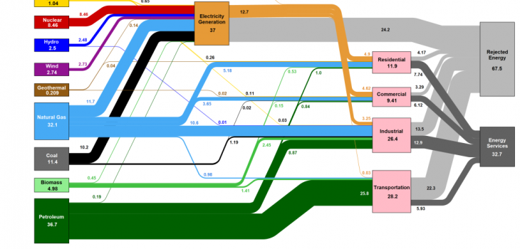
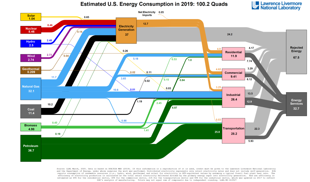
Fascinating chart showing US energy usage. Biggest takeaway is how far more is wasted in “rejected energy” (explanation in the article) vs. used. However, that’s good news for renewables which are nearly 100% efficient. When you replace a fossil fuel with a renewable the ratio isn’t 1:1 its more like 1:5.

Rejected energy is part of the energy of a fuel — such as gas or petrol — that could be used for a purposeful activity, like making electricity or transport. However, because of the technologies that we currently use to consume fuels, a lot of it gets tossed out by turning it into heat in the environment, which is totally useless [or worse]. For a coal-fired power station, for instance, about two-thirds of the energy released when the coal is burnt is discarded as heat in the environment. This reject energy sometimes appears as clouds of vapor coming off a power station’s cooling towers, such as the well-known ones at Didcot in England.
https://electrek.co/2020/04/09/us-energy-chart-2019/